CPT: Difference between revisions
*>Anonymous |
*>Anonymous |
||
| Line 223: | Line 223: | ||
Each bar indicates the total (tons or $-value) transiting at each foot of maintained depth, shown along the ''x''-axis. The different colors correspond to the respective traffic types shown in the legend at the top-right of each chart. It is interesting to note that high tonnage levels at a given draft do not necessarily equate to an equally high $-value, and vice versa. This is of course due to price differences in the various commodities, and the design drafts of the vessels that typically carry commodities of a particular type (i.e. dry bulk carriers vs. container ships). | Each bar indicates the total (tons or $-value) transiting at each foot of maintained depth, shown along the ''x''-axis. The different colors correspond to the respective traffic types shown in the legend at the top-right of each chart. It is interesting to note that high tonnage levels at a given draft do not necessarily equate to an equally high $-value, and vice versa. This is of course due to price differences in the various commodities, and the design drafts of the vessels that typically carry commodities of a particular type (i.e. dry bulk carriers vs. container ships). | ||
='''Viewing and explanation of Flow tables'''= | |||
The previous section described how to use CPT to analyze the commerce utilizing one particular reach within the vast waterway transportation infrastructure. The total tons and/or $-value utilizing each foot of maintained depth is one obvious way to gauge the overall significance of that channel. However, another indicator of significance can be found by looking at all the other reaches transited by the cargo utilizing that channel, in order to ascertain how critical the channel is to the function of the broader transportation network. This section describes how to use the Flow feature of CPT towards this end. | |||
==''Selection of single sub-reach for Flow analysis''== | |||
Because of the large amounts of data that must be processed during the Flow queries, it is highly recommended that only single reaches be selected for analysis. Failure to do this will often result in extremely long query times, and the hosting web server will likely time out before the request is completed. | |||
For this example, the Grays Harbor, WA Entrance Channel is chosen for analysis by returning to the Reach Selection tab. This reach should be selected after all other Charleston Harbor reaches used in the previous example have been removed. Figure 27 shows the Grays Harbor Entrance Channel being selected from the Reach Selection tab. | |||
[[Image:Figure27_SelectionForFlow.jpg|400px|thumb|left|Fig. 27 – Selection of Grays Harbor, WA Entrance Channel for CPT Flow example]] | |||
<br style="clear:both" /> | |||
==''Tips for faster query times and .kml settings''== | |||
Due to the large amounts of commerce data that must be processed while performing a Flow request, it many instances it is recommended that Preferences be set so as to improve query times. Depending on user requirements, the simplest way to do this is to request a single year of coverage. The same commodity flow patterns will be revealed for most cases, and the amount of data to be processed is reduced considerably. An alternate way to improve query times is to employ the Traffic and/or Commodity type filters, again depending upon whether user requirements allow. All of these settings are controlled via the Preferences tab and are explained in detail in Section 2.3 ''Explanation of Preferences''. For the Grays Harbor example presented here, select only year 2007 for running the Flow query. | |||
Viewing of the Flow query results gives a powerful visual indicator of the significance of a given channel to the broader maritime navigation system. Therefore it is important to set the .kml settings in the Preferences tab so as to maximize visual impact. For instances in which commodity flow patterns need to be shown over large regions such as the Gulf of Mexico or the Ohio River Valley, the Line option for the .kml overlays typically works best. Though the Polygon option provides for flexibility concerning minimum and maximum overlay widths, the graphics rendering within Google Earth tends to make the polygons difficult to see at far zoom levels. Conversely, for situations where commodity flows are desired across a smaller region such as San Francisco Bay, then the Polygon option may prove to be more effective. For the Grays Harbor example, choose the Line option under KML Settings, with Linear scaling, a minimum width of 1 pixel, and a maximum width of 10 pixels. | |||
==''Exporting Flow table to and viewing in Google Earth''== | |||
Once Preferences have been defined and saved, the Flow query can be executed by clicking on the Flow tab to the right of the Rankings tab. For high-tonnage channels, running the Flow query may take several seconds; however, for smaller locales like Grays Harbor, the wait times should be negligible. Figure 28 shows the Flow query results for Grays Harbor, WA. | |||
[[Image:Figure28_FlowResults.jpg|400px|thumb|left|Fig. 28 – CPT Flow query results for Grays Harbor, WA, 2007]] | |||
<br style="clear:both" /> | |||
The first row in the Flow table shows the channel selected previously using the Reach Selection menu, in this case the Grays Harbor Entrance Channel. The Tons and Dollars entries for this reach (1,244,705 and $246,148,859, respectively) represent all cargo transiting the reach during 2007 and are equal to those that would appear if the Rankings tab were to be selected. All of the remaining entries in the Flow table represent other reaches elsewhere within the waterway network where the cargo transiting the Grays Harbor Entrance Channel also transits. The tons and $-value figures indicate how much of the cargo transiting the Grays Harbor Entrance Channel also transits each respective reach. | |||
It is useful to be able to visualize this cargo flow information, and so CPT allows the user to export these results to Google Earth using the Export to KML button found below the Flow Reaches table, as shown in Fig. 28. The Flow results for Grays Harbor, WA for 2007 are shown in Figure 29. | |||
[[Image:Figure29_FlowGoogleEarth.jpg|400px|thumb|left|Fig. 29 – CPT Flow query results for Grays Harbor, WA, 2007, as shown in Google Earth]] | |||
<br style="clear:both" /> | |||
The cargo transiting the entrance channel is also seen to travel elsewhere along the west coast, with various amounts also transiting the Columbia River, the British Columbia Inside Passage, LA-Long Beach, and Humboldt Bay. Each link can be selected and the tons and $-value transiting that link viewed, as shown in Figure 29. While the Line feature makes it easier to see the various reaches from a far zoom position, the Polygon feature often gives a better indication for cargo flow within a project, as shown in Figure 30. | |||
[[Image:Figure30_PolygonFlow.jpg|400px|thumb|left|Fig. 30 – Polygon feature used to show cargo flow through Grays Harbor, WA, 2007]] | |||
<br style="clear:both" /> | |||
One can see from the overlay that roughly half of the tonnage transiting the Grays Harbor Entrance Channel is foreign (non-Canadian) traffic, and therefore cannot presently be tracked by CPT beyond the extent of the entrance. Only domestic shipments and Canadian imports and exports are tracked by CPT over deep water and therefore able to be plotted in Google Earth. However, for USACE-maintained projects such as Grays Harbor, foreign traffic flow is plotted, as seen in Fig. 30. Use Google Earth to select each sub-reach and see how the cargo transiting the entrance channel is distributed across the Grays Harbor project. | |||
==''Exporting Flow table to Microsoft Excel, explanation of fields''== | |||
The details of each channel and deep-water link listed in the Flow Reaches table can be written to a spreadsheet file for later viewing and processing by clicking the Export to Excel button at the bottom left of the table, as seen in Fig.28. The resulting spreadsheet is shown in Figure 31. | |||
The various fields contain the underlying data that is processed and summed to form the totals seen previously in the Flow Reaches table (Fig. 28). The spreadsheet contains additional fields indicating the Traffic type and Commodity type making up the totals for each reach. The top of the spreadsheet file contains information on data filters set using the Preferences tab prior to running the Flow query. | |||
[[Image:Figure31_FlowSpreadsheet.jpg|400px|thumb|left|Fig. 31 – Flow Details spreadsheet for Grays Harbor, WA Entrance Channel, 2007]] | |||
<br style="clear:both" /> | |||
==''Viewing details for entries in Flow table, and exporting to Microsoft Excel''== | |||
One final level of detail is available using CPT and cargo Flow analysis. Each entry in the Flow Reaches table (Fig. 28) may be selected, revealing a details tab similar to those described previously for Reach Details in Section 4.1 ''Selection of sub-reach from Rankings table''. Figure 32 shows the details tab that appears for the Humboldt Bay approach, which is highlighted in Figure 29. | |||
[[Image:Figure32_FlowDetails.jpg|400px|thumb|left|Fig. 32 – Flow details for Grays Harbor, WA Entrance Channel and Humboldt Bay, CA]] | |||
<br style="clear:both" /> | |||
The details tab shows that all of the cargo transiting both the Grays Harbor Entrance Channel and the Humboldt Approach is domestic traffic consisting of roughly squared wood. The shipments have a total tonnage of 151,000 and a total $-value of $13.7 million. | |||
Below the details tables shown in Fig. 32, a draft profile chart is displayed showing the depth-utilization of the shipments traveling between Grays Harbor and Humboldt Bay. Figure 33 shows the draft profile for tons. | |||
[[Image:Figure33_DraftProfileShared.jpg|400px|thumb|left|Fig. 33 – Draft profile for shipments between Grays Harbor and Humboldt Bay, 2007]] | |||
<br style="clear:both" /> | |||
The raw data underlying the chart shown in Figure 33 can be obtained by clicking the Export to Excel button below the tables in Fig. 32. The resulting spreadsheet can be seen in Fig. 34 and includes fields for Commodity type, Traffic type, draft, tons, and $-value. This data provides a complete characterization of the cargo movements between the two locations. | |||
[[Image:Figure34_DraftProfileSpreadsheet.jpg|400px|thumb|left|Fig. 34 – Draft profile details for traffic shared between Grays Harbor and Humboldt Bay]] | |||
<br style="clear:both" /> | |||
Revision as of 16:45, 25 August 2010
Channel Portfolio Tool (CPT)
POC: Dr. Kenneth Ned Mitchell <br\>Kenneth.n.mitchell@usace.army.mil <br\>601-634-2022 <br\>US Army Engineer Research and Development Center (ERDC) <br\>Coastal and Hydraulics Lab (CHL)
Active URL (Corps machines only): https://itlgis01.usace.army.mil/CPTWeb/
CPT is developmental software that is updated frequently.
CPT general layout
Setting the level of analysis (Reach, Project, District, Division)
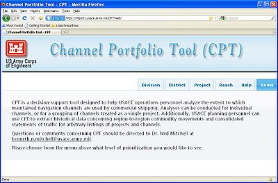
CPT is designed to enable analysis of commercial utilization of the Corps-maintained waterway infrastructure at a variety of coverage levels. At the most detailed level, individual channel sub-reaches may be chosen for analysis and compared to other sub-reaches in the USACE portfolio of navigation projects. However, in order to provide decision support to personnel at all levels of Corps management, CPT can also be used to analyze and compare commercial usage figures at the Project, District, and Division levels. For example, a District program manager might want to see which navigation project under his or her control handles the most exports of a particular commodity. CPT pulls from a large database that is maintained by the Corps’ Waterborne Commerce Statistics Center (WCSC). Setting the desired level of analysis is done through the CPT Home screen: https://itlgis01.usace.army.mil/CPTWeb/. Figure 1 shows the four levels of analysis provided by CPT; the desired level is chosen by simply clicking on the respective link.
Selection of items to be ranked and/or analyzed
The entities (reaches, Project, Districts, etc.) to be analyzed and or compared using CPT is determined via the selection made on the CPT Home screen. Once this selection is made, the user is taken to a Selection page wherein the desired entities can be selected from nested drop-down menus. Figure 2 shows the Selection page for Reach-level analysis.
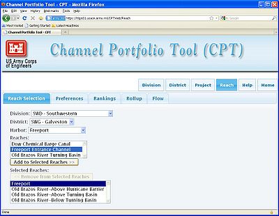
Starting at the Division level, the user chooses the appropriate selection from each successive drop-down menu. Reaches inadvertently selected may be removed at any time using the “Remove from Selected Reaches” button.
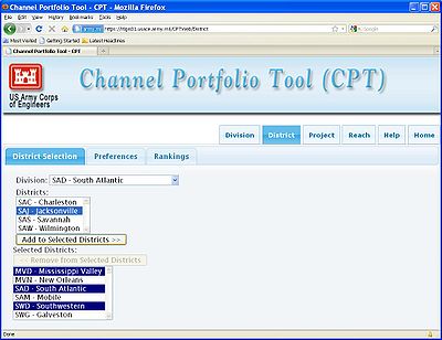
Note that the entities available via the Selection screen will change depending on the level of analysis chosen on the CPT Home Screen. Figure 3 shows the Selection page when District-level analysis is specified by the user. In this case, no further drop-down menus become available after the Districts are selected, since the user has already reached the specified level of analysis. The format is the same for the Division and Project levels of analysis, respectively.
Explanation of Preferences
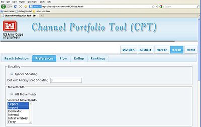
Once the user is done making selections using the drop-down menus, the Preferences tab immediately to the right of the Selection tab should be clicked in order to specify data filtering criteria and other query parameters. Figure 4 shows the Preferences page, and each of the user-specified query parameters is described in the following sections.
Shoaling considerations
The latest version of CPT allows the user to specify a single, default shoaling rate to be applied uniformly across all selected sub-reaches. Subsequent versions of CPT will allow for upload of present channel controlling depths so that shoaling conditions are more accurately represented. In the meantime, the default shoaling feature allows the user to focus on the commercial shipping utilizing just the deepest portions of maintained channels, i.e. those depths most vulnerable to shoaling during a given budget cycle, and also those depths most dependent upon USACE maintenance dredging to remain clear for navigation. CPT indirectly calculates channel limiting depths for each year based on the deepest transiting vessel calls in the Waterborne Commerce database found to have utilized a given channel. The assumption made is that commercial shipping would utilize the deeper depths if they were in fact available. This assumption has significant limitations, and again, subsequent versions of CPT will allow for controlling depths to be entered directly by users throughout USACE to provide a more accurate representation of channel conditions. Figure 4 shows the Shoaling portion of the Preferences page, with 3 ft of shoaling specified by the user. Alternatively, the user may choose to ignore shoaling conditions altogether, in which case all tonnage (or $-value) transiting at all depths will be used as the scoring metric when ranking chosen entities.
Movement types to include
CPT provides the option of considering just particular traffic types (i.e. imports, exports, coastwise domestic, etc.) when comparing selections. These traffic types are listed in the Movements section of the Preferences page, as seen in Figure 4; the user has selected only imports and exports for consideration. Additional traffic types available include Domestic movements, representing shipments that travel over coastal and/or Great Lakes waters, and Internal movements, indicating shipments that remain on the inland river system. Intra-territory and Ferry traffic is not yet included within CPT but will be available in subsequent versions.
Docked vs. transiting tonnage
Within a given channel or project, waterborne commerce may load and unload at docks, piers, and berthing terminals, while other traffic may simply transit the channel without stopping while on its way to some other destination. In both instances, the channel in question supports those shipments in the course of their voyage, however the CPT user may wish to see one or the other for the purposed of their analysis. Figure 5 shows the portion of the CPT Preferences page found below the Movements section discussed above (and shown in Fig. 4).
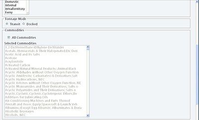
The two options presently available in CPT include “Transit” (selected in Fig. 5) and “Docked.” In this version of CPT, the “Transit” option actually considers both tonnage that docks within a reach and also through tonnage that transits without stopping. The “Docked” option counts just the tonnage that actually docks within a given reach. Subsequent versions of CPT will include a third toggle that isolates through tonnage from docked tonnage.
Commodity selection
The Waterborne Commerce database classifies cargo into 662 separate commodity listings. CPT allows the user to choose any subset of these codes for inclusion in the analysis. Figure 5 shows the Commodities section in the Preferences page, below the Tonnage Mode section discussed previously. The user may simply choose to include all commodities (as indicated in Fig. 5), or select individual commodity listings from the menu. Subsequent versions of CPT will feature nested commodity groupings and selections to make this process easier.
Years of coverage
CPT presently offers coverage of waterborne commerce movements starting in 2003 up until 2007. Figure 6 shows the section of the Preferences page below the Commodities section wherein years of coverage are specified. The box indicating All Years of available data is checked as the default setting.
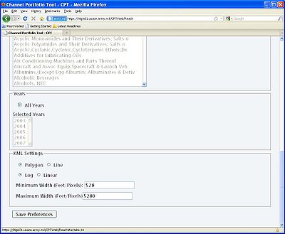
It should be noted that prior to 2005, draft information was not recorded for foreign vessels, therefore draft-profile charts cannot be generated using foreign cargo data from years 2003 and 2004.
Google Earth .kml settings
CPT allows for exporting of .kml files for viewing in Google Earth to help convey the relative significance of sub-reaches and deep-water waterway network links in terms of the tons and/or $-value of cargo utilizing those entities. Results from both Rankings queries and Flow queries can be exported for viewing in Google Earth.
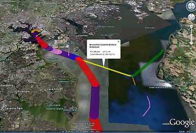
Two methods are available for displaying CPT reaches and network links within Google Earth: 1) the “Polygon” option allows the user to define an upper and lower bound for the width of the overlays, and 2) the “Line” option uses simple lines between 1 and 10 pixels wide to represent channels and network links. Due to the way in which each option is rendered within the Google Earth viewing environment, it is recommended that the Polygon option be selected when comparing reaches within a single Project-sized area (e.g. Baltimore Harbor or the Galveston Bay area), while the Line option works better when wanting to see regional comparisons of channel significance (i.e. commodity flows along the East coast or a comparison of reaches in multiple harbors).
Figure 6 shows the KML Settings section of the Preferences page. In the example shown, the Polygon option is selected, with a minimum width of 528 ft and a maximum width of 5280 ft. Note that if the Line option were selected, the width values would need to be specified in terms of screen pixels, with a minimum and maximum of 1 and 10 pixels, respectively.
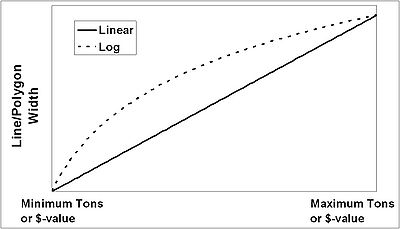
The Log/Linear toggle shown in Figure 6 determines the manner in which the width of each reach is scaled for display. Recall that the width of each reach overlay is determined by the tons or $-value utilizing the respective reach. The simplest way to convey this is to have a linear scale, with the highest-tonnage reach having the maximum specified width, and all subsequent reach widths scaled accordingly down to the reach with the fewest tons or $-value. However, often times the tonnage or $-value utilizing the selected reaches will vary by orders of magnitude, so the linear scaling can result in a less-than-ideal visual conveyance of the relative significance of each reach. To address this issue, CPT provides a Log scaling option, which uses a more gradual reduction in line width as the underlying tonnage or $-value decreases. Figure 7 gives a general idea of the differences between Linear and Log width scaling.
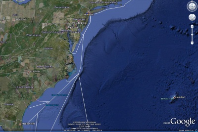
Figures 8 and 9 show the Polygon and Line overlay options, respectively. In each case, the clicking on the reach overlays shows the underlying tons and $-value.
Saving Preferences
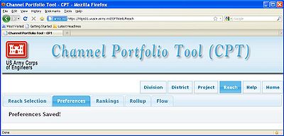
Once all filter criteria have been specified using the Preferences page, the Save Preferences button (Fig. 6, bottom of page) must be pressed before the query can be executed. Figure 10 shows the resulting screen, giving confirmation that the Preferences have been recorded and that the various analyses can now be performed.
Viewing of Rankings, Roll-ups, and Flow tables
Once Preferences have been saved, the CPT user may select one of the three tabs shown to the left of the Preferences tab in Figure 10. The remainder of this page will give step-by-step instructions on how to use the Rankings, Rollup, and Flow features of CPT for analysis.
A typical USACE deep-draft navigation project, such as Charleston Harbor or the Sabine-Neches Waterway, will contain many miles of maintained channels. In a limited funding environment, the challenge presented to Corps management during each budget cycle is how to allocate Operations and Maintenance (O&M) funding such that the most critical (in terms of both utilization and condition) sub-reaches within projects are given priority for dredging while less critical portions are deferred until additional funds are made available. CPT was designed to address this issue, and the following sections will show how to go about prioritizing sub-reaches within a project for O&M funding, using Charleston Harbor, S.C. as an example.
Selecting sub-reaches
As described in Section 2.2 Selection of items to be ranked and/or analyzed, the reaches to be compared are chosen after selecting the Reaches analysis level on the CPT Home screen. Figure 11 shows the reaches with the Charleston Harbor Project being selected.
Note that a prompt appears indicating when all reaches within the Project have been selected. The next step is to set query preferences.
Setting Preferences
As covered in Section 2.3 Explanation of Preferences, the Preferences tab should be selected once all of the reaches that are to be compared have been chosen. In Figure 11, the Preferences tab is located immediately to the right of the highlighted Reach Selection tab. Once selected, the Preferences can be set according to user specifications. For the purposes of this example with Charleston Harbor, leave all Preferences set to the default selections (Ignore Shoaling checked, All Movements checked, Transiting tonnage mode selected, all commodities included) except for the Years setting, which should be set to 2007 only in order to improve query times, as shown in Figure 12. Note that the All Years box must first be unchecked before the year menu becomes active. Once the desired year has been highlighted, clicking the Save Preferences button will confirm the query settings.
Viewing Rankings tables
With the Preferences saved and the CPT window confirming this as shown in Figure 10, proceed to the Rankings page by clicking on the tab immediately to the right of the highlighted Preferences tab. Figure 13 shows the Rankings page that should result for this example with Charleston Harbor.
Note that by default the reaches are ranked in terms of tons, but that a second column containing the $-value of tonnage in each reach is also included. The reaches can be ranked in terms of $-value of cargo by simply clicking on the Dollars column. Figure 14 shows the re-ordering of reaches when ranked by $-value instead of tons.
The reaches can be sorted in either descending (default) or ascending order, in terms of both tons or $-value, by clicking on the Tons and Dollars column labels, respectively. Note that only the first 10 reaches are shown initially, but that the number shown can be expanded using the small drop-down box shown below the rankings table.
Exporting Rankings tables to Microsoft Excel
The Rankings table can be written to a Microsoft Excel spreadsheet file for subsequent viewing and processing by using the Export to Excel button found at the bottom-left of the Rankings page (see Figure 14). Appearances will vary depending on web browser type and settings, but a prompt should appear giving the user the option of saving the file or launching Excel and opening the file directly. Figure 15 shows an example using Mozilla Firefox.
Figure 16 shows the Microsoft Excel spreadsheet once exported and opened for viewing.
Exporting to and viewing of Rankings in Google Earth
The results of the rankings query may also be exported to Google Earth to help visualize the relative significance of each reach. This is done by selecting the Export to KML button found just below the previously discussed Export to Excel button (see Figs. 13-15). As with the spreadsheet option, once selected, a user prompt will appear giving the option of saving the results as a .kml file for later viewing or launching Google Earth and viewing the results directly. Figure 17 shows this prompt as it appears in Mozilla Firefox.
The actual format of the resulting Google Earth overlay file will depend upon the KML settings previously defined on the Preferences page (Section 2.3.6 Google Earth .kml settings). The default settings are shown for the Charleston Harbor example in Figure 18.
The width of each polygon represents the total tons utilizing the respective reach within Charleston Harbor. The polygon overlays representing each reach are fully interactive within the Google Earth environment, and can be clicked on to reveal the respective reach name, tons, and $-value (these values should match the figures seen in the Rankings table). The color scheme is intended only to help differentiate the separate reaches, and has no connection to the reach in terms of tons or $-value.
Viewing Rankings charts and saving to file or to clipboard
Scrolling down the Rankings page below the table and export buttons, two charts can be seen which offer another visualization of the relative significance of each reach in terms of tons and $-value of cargo. Figs. 19 and 20 show the tons and $-value charts, respectively, for the Charleston Harbor example.
In all cases, the charts may be either saved to file or copied to the clipboard by right clicking within the chart area and selecting the desired option.
Viewing Details of a single sub-reach
In addition to offering comparisons of multiple reaches in terms of total tons and total $-value of cargo, CPT also allows for single reaches to be analyzed in detail in order to provide support for maintenance dredging funding decisions. The following sections will describe how to go about accessing and interpreting these single reach details using CPT.
Selection of sub-reach from Rankings table
Starting with the Rankings table described previously, the user may select any reach by clicking on the corresponding row, as shown in Figure 21.
As can be seen, the row will become highlighted and a new tab will appear above the Rankings table with the corresponding reach name. Clicking on this new tab will bring up the Details page for that particular reach.
Explanation of Traffic Rollup
The first table shown in the reach details page provides a Traffic Rollup for all cargo movements utilizing the channel. Figure 22 shows the Traffic Rollup table at the top of the Details page for the Charleston Harbor Entrance Channel. The Traffic Rollup table shows the total tons and $-value of cargo of each movement type (imports, exports, etc.). As described in Section 2.3.2 Movement types to include, domestic cargo indicates shipments that travel over coastal (or Great Lakes) waters, while Internal traffic represents cargo that stays on the inland river system and inter-coastal waterways.
In the case of the Charleston Entrance Channel, the relatively small amounts of Internal tonnage can be attributed to possible miscoding of the traffic fields (they should indicated coastwise domestic) in the Waterborne Commerce database, and also to some minor routing issues still being addressed by the CPT development team.
Explanation of Reach Details
Below the Traffic Rollup table just described, the full Reach Details table can be found. This table lists every single commodity type, with respective traffic types, utilizing the chosen reach. Figure 23 shows the Reach Details table for the Charleston Harbor example.
As with all tables displayed within CPT, data can be sorted by simply clicking on the respective column.
Exporting to and viewing in Microsoft Excel
The Reach Details table may be exported to Microsoft Excel by clicking the button in the lower left, as shown in Figure 23. The resulting spreadsheet is shown in Figure 24.
The spreadsheet offers all of the raw Waterborne Commerce data for the channel in question. In addition to the commodity and traffic fields offered in the Reach Details table (Fig. 23), the spreadsheet also contains draft information, showing which commodities, tons, $-value, and traffic type transiting at each foot of maintained channel depth.
Draft profiles of tons and $-value; saving to file or clipboard
Scrolling down the Reach Details page below the tables described in the previous sections, the user finds two charts providing useful visualizations of the commercial traffic utilizing the reach. Rather than just showing total tons and/or $-value transiting a given channel, these charts include the draft information of the vessels carrying the cargo. The result is a very powerful indication of the extent to which commercial shipping utilizes the depths maintained by USACE dredging activities. Figures 25 and 26 shows the draft profile charts for tonnage and $-value, respectively, through the Charleston Entrance Channel.
Each bar indicates the total (tons or $-value) transiting at each foot of maintained depth, shown along the x-axis. The different colors correspond to the respective traffic types shown in the legend at the top-right of each chart. It is interesting to note that high tonnage levels at a given draft do not necessarily equate to an equally high $-value, and vice versa. This is of course due to price differences in the various commodities, and the design drafts of the vessels that typically carry commodities of a particular type (i.e. dry bulk carriers vs. container ships).
Viewing and explanation of Flow tables
The previous section described how to use CPT to analyze the commerce utilizing one particular reach within the vast waterway transportation infrastructure. The total tons and/or $-value utilizing each foot of maintained depth is one obvious way to gauge the overall significance of that channel. However, another indicator of significance can be found by looking at all the other reaches transited by the cargo utilizing that channel, in order to ascertain how critical the channel is to the function of the broader transportation network. This section describes how to use the Flow feature of CPT towards this end.
Selection of single sub-reach for Flow analysis
Because of the large amounts of data that must be processed during the Flow queries, it is highly recommended that only single reaches be selected for analysis. Failure to do this will often result in extremely long query times, and the hosting web server will likely time out before the request is completed.
For this example, the Grays Harbor, WA Entrance Channel is chosen for analysis by returning to the Reach Selection tab. This reach should be selected after all other Charleston Harbor reaches used in the previous example have been removed. Figure 27 shows the Grays Harbor Entrance Channel being selected from the Reach Selection tab.
Tips for faster query times and .kml settings
Due to the large amounts of commerce data that must be processed while performing a Flow request, it many instances it is recommended that Preferences be set so as to improve query times. Depending on user requirements, the simplest way to do this is to request a single year of coverage. The same commodity flow patterns will be revealed for most cases, and the amount of data to be processed is reduced considerably. An alternate way to improve query times is to employ the Traffic and/or Commodity type filters, again depending upon whether user requirements allow. All of these settings are controlled via the Preferences tab and are explained in detail in Section 2.3 Explanation of Preferences. For the Grays Harbor example presented here, select only year 2007 for running the Flow query. Viewing of the Flow query results gives a powerful visual indicator of the significance of a given channel to the broader maritime navigation system. Therefore it is important to set the .kml settings in the Preferences tab so as to maximize visual impact. For instances in which commodity flow patterns need to be shown over large regions such as the Gulf of Mexico or the Ohio River Valley, the Line option for the .kml overlays typically works best. Though the Polygon option provides for flexibility concerning minimum and maximum overlay widths, the graphics rendering within Google Earth tends to make the polygons difficult to see at far zoom levels. Conversely, for situations where commodity flows are desired across a smaller region such as San Francisco Bay, then the Polygon option may prove to be more effective. For the Grays Harbor example, choose the Line option under KML Settings, with Linear scaling, a minimum width of 1 pixel, and a maximum width of 10 pixels.
Exporting Flow table to and viewing in Google Earth
Once Preferences have been defined and saved, the Flow query can be executed by clicking on the Flow tab to the right of the Rankings tab. For high-tonnage channels, running the Flow query may take several seconds; however, for smaller locales like Grays Harbor, the wait times should be negligible. Figure 28 shows the Flow query results for Grays Harbor, WA.
The first row in the Flow table shows the channel selected previously using the Reach Selection menu, in this case the Grays Harbor Entrance Channel. The Tons and Dollars entries for this reach (1,244,705 and $246,148,859, respectively) represent all cargo transiting the reach during 2007 and are equal to those that would appear if the Rankings tab were to be selected. All of the remaining entries in the Flow table represent other reaches elsewhere within the waterway network where the cargo transiting the Grays Harbor Entrance Channel also transits. The tons and $-value figures indicate how much of the cargo transiting the Grays Harbor Entrance Channel also transits each respective reach. It is useful to be able to visualize this cargo flow information, and so CPT allows the user to export these results to Google Earth using the Export to KML button found below the Flow Reaches table, as shown in Fig. 28. The Flow results for Grays Harbor, WA for 2007 are shown in Figure 29.
The cargo transiting the entrance channel is also seen to travel elsewhere along the west coast, with various amounts also transiting the Columbia River, the British Columbia Inside Passage, LA-Long Beach, and Humboldt Bay. Each link can be selected and the tons and $-value transiting that link viewed, as shown in Figure 29. While the Line feature makes it easier to see the various reaches from a far zoom position, the Polygon feature often gives a better indication for cargo flow within a project, as shown in Figure 30.
One can see from the overlay that roughly half of the tonnage transiting the Grays Harbor Entrance Channel is foreign (non-Canadian) traffic, and therefore cannot presently be tracked by CPT beyond the extent of the entrance. Only domestic shipments and Canadian imports and exports are tracked by CPT over deep water and therefore able to be plotted in Google Earth. However, for USACE-maintained projects such as Grays Harbor, foreign traffic flow is plotted, as seen in Fig. 30. Use Google Earth to select each sub-reach and see how the cargo transiting the entrance channel is distributed across the Grays Harbor project.
Exporting Flow table to Microsoft Excel, explanation of fields
The details of each channel and deep-water link listed in the Flow Reaches table can be written to a spreadsheet file for later viewing and processing by clicking the Export to Excel button at the bottom left of the table, as seen in Fig.28. The resulting spreadsheet is shown in Figure 31.
The various fields contain the underlying data that is processed and summed to form the totals seen previously in the Flow Reaches table (Fig. 28). The spreadsheet contains additional fields indicating the Traffic type and Commodity type making up the totals for each reach. The top of the spreadsheet file contains information on data filters set using the Preferences tab prior to running the Flow query.
Viewing details for entries in Flow table, and exporting to Microsoft Excel
One final level of detail is available using CPT and cargo Flow analysis. Each entry in the Flow Reaches table (Fig. 28) may be selected, revealing a details tab similar to those described previously for Reach Details in Section 4.1 Selection of sub-reach from Rankings table. Figure 32 shows the details tab that appears for the Humboldt Bay approach, which is highlighted in Figure 29.
The details tab shows that all of the cargo transiting both the Grays Harbor Entrance Channel and the Humboldt Approach is domestic traffic consisting of roughly squared wood. The shipments have a total tonnage of 151,000 and a total $-value of $13.7 million.
Below the details tables shown in Fig. 32, a draft profile chart is displayed showing the depth-utilization of the shipments traveling between Grays Harbor and Humboldt Bay. Figure 33 shows the draft profile for tons.
The raw data underlying the chart shown in Figure 33 can be obtained by clicking the Export to Excel button below the tables in Fig. 32. The resulting spreadsheet can be seen in Fig. 34 and includes fields for Commodity type, Traffic type, draft, tons, and $-value. This data provides a complete characterization of the cargo movements between the two locations.